


Photo : La netteté, c'est surfait ! (Le FLOU en Photographie)
Sharpness is overatted! (I like blurr) J'ai toujours aimé le flou : de profondeur de champ, de mouvement, sur le sujet, sur l'avant ou l'arrière-plan... Il rend nos photos tellement plus picturales !

PLEASE SCROLL IN THE FRENCH ARTICLE, ENJOYING THE PHOTOS, TO GET TO THE ENGLISH VERSION BELOW. 🤗
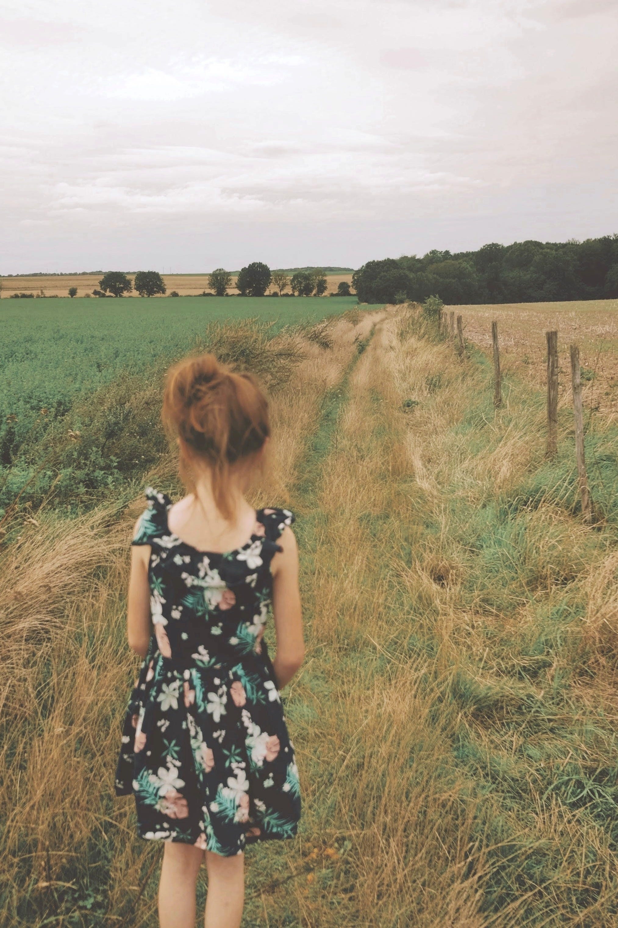
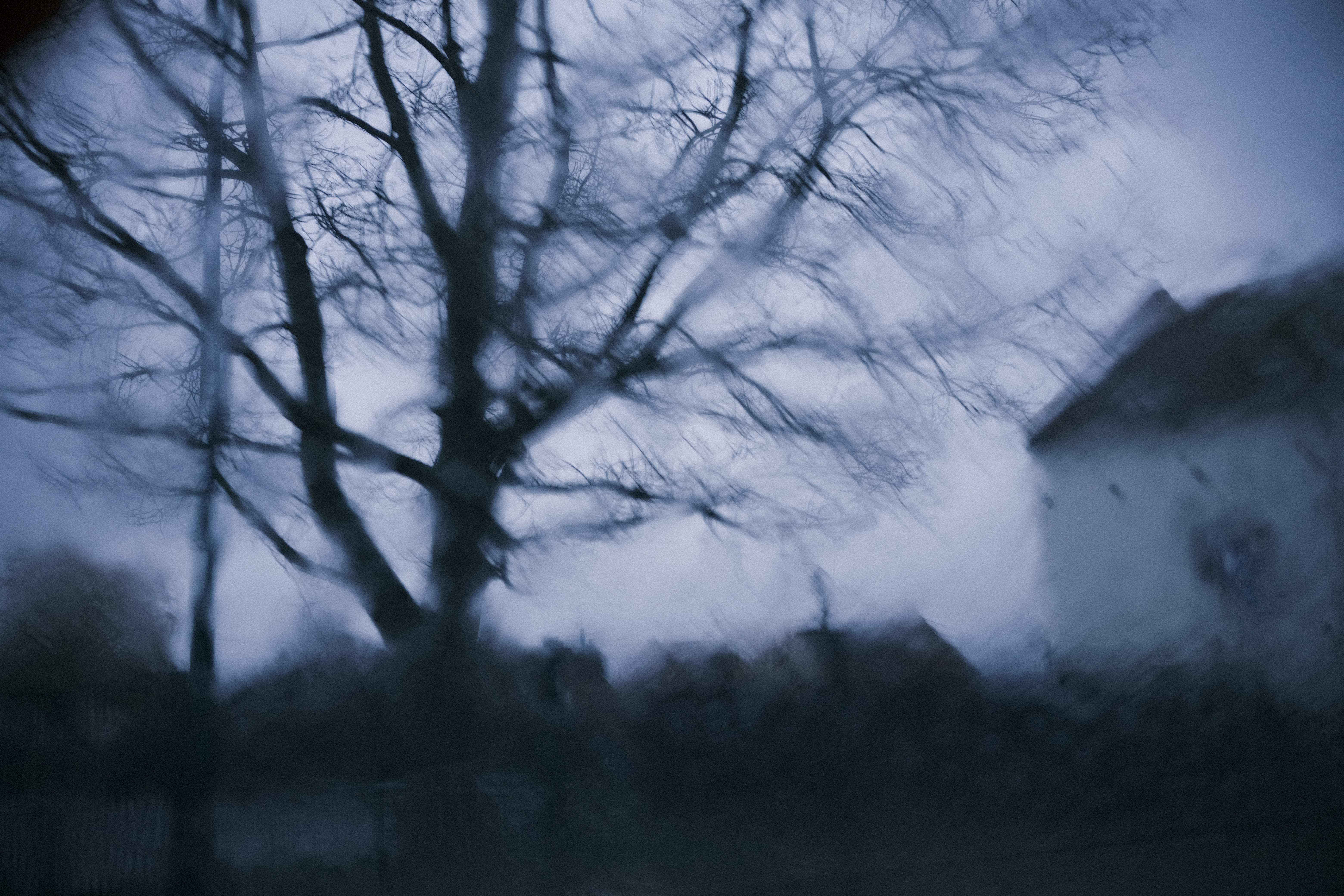
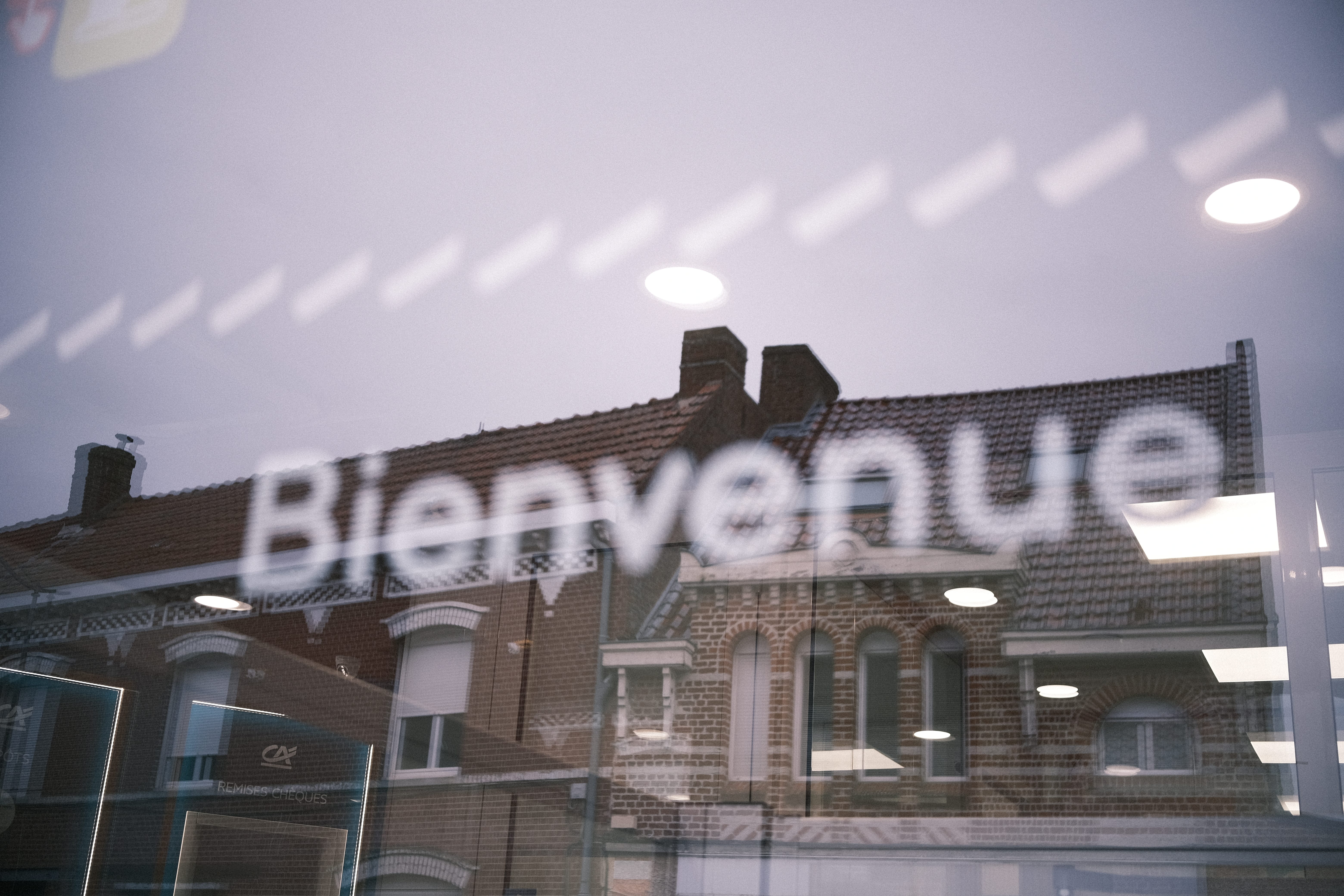
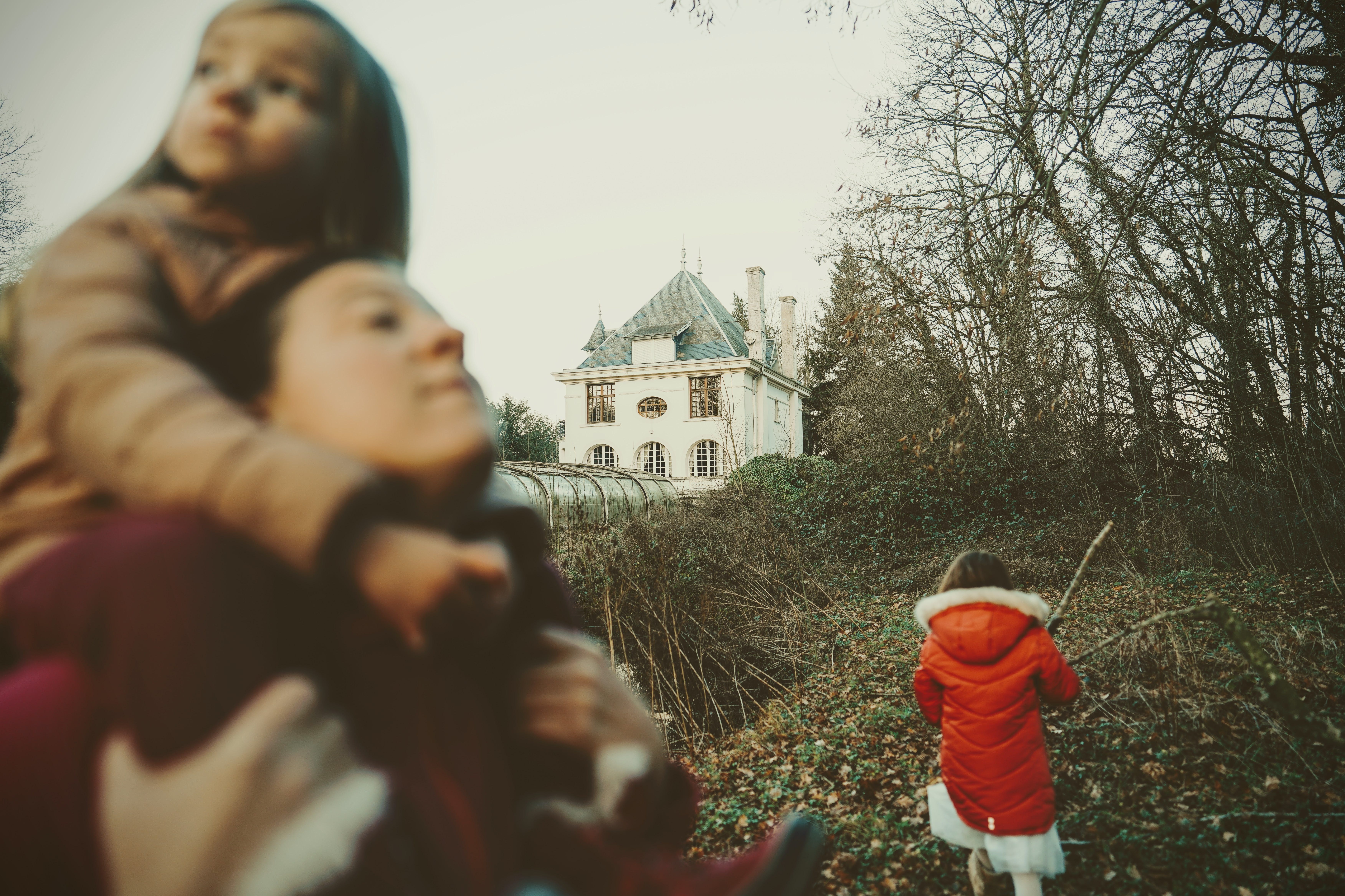
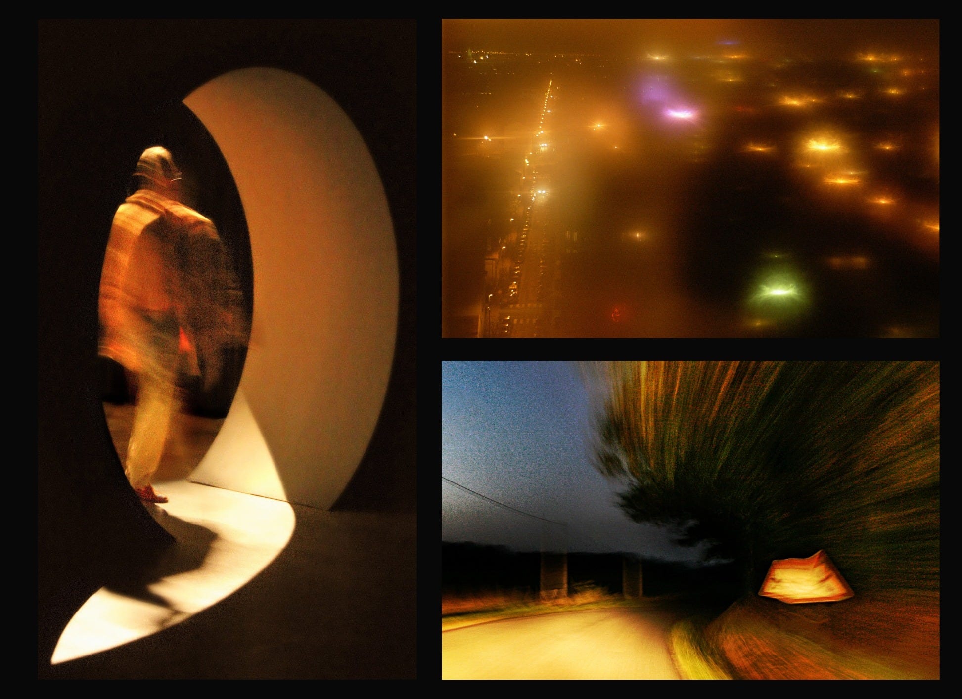
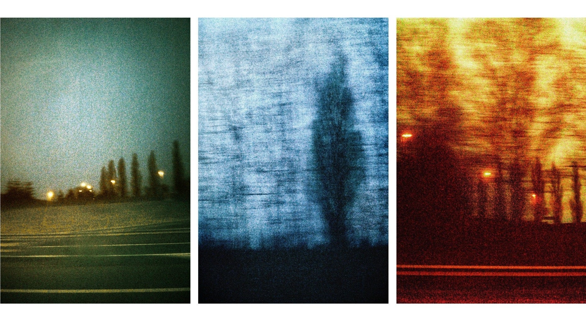
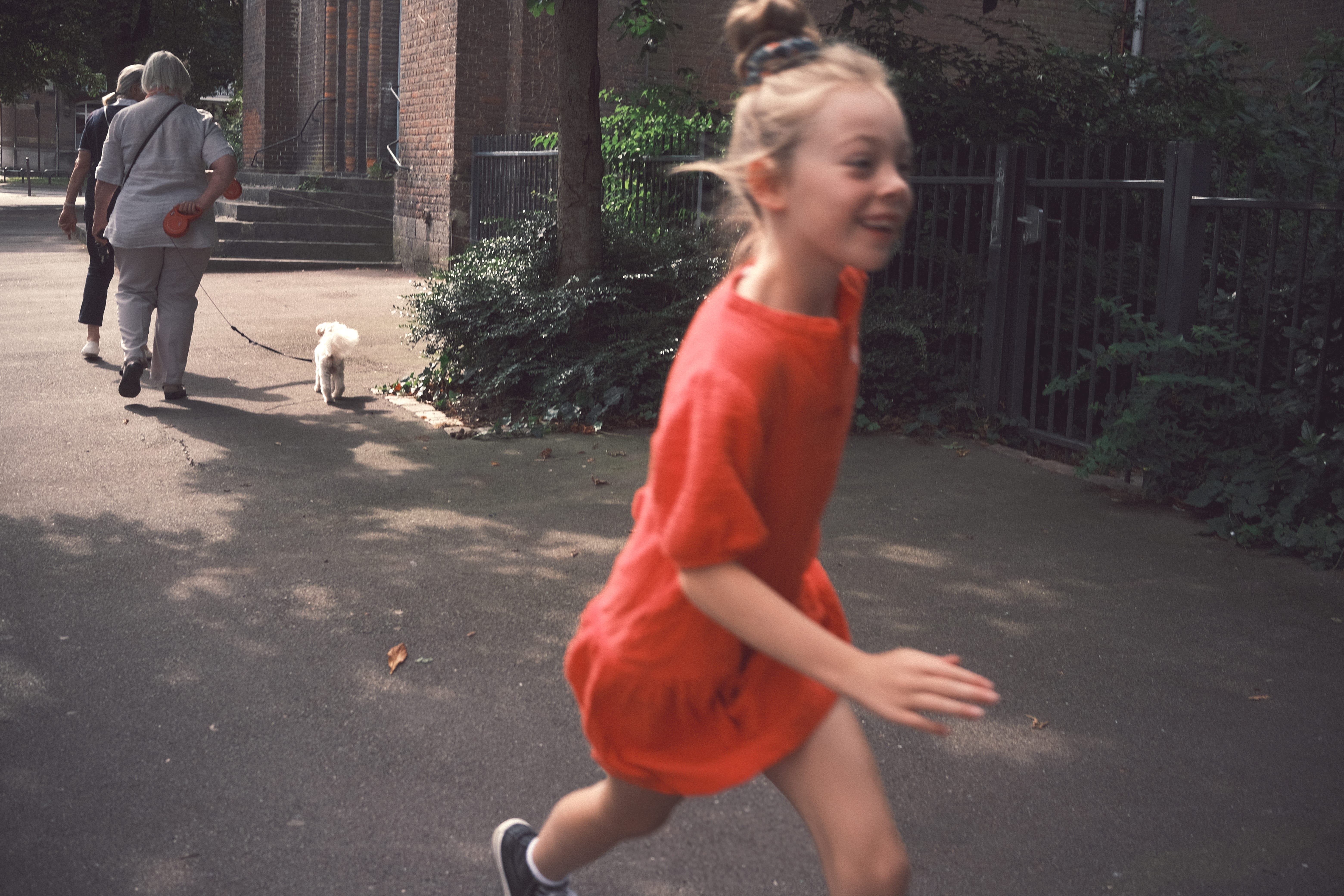
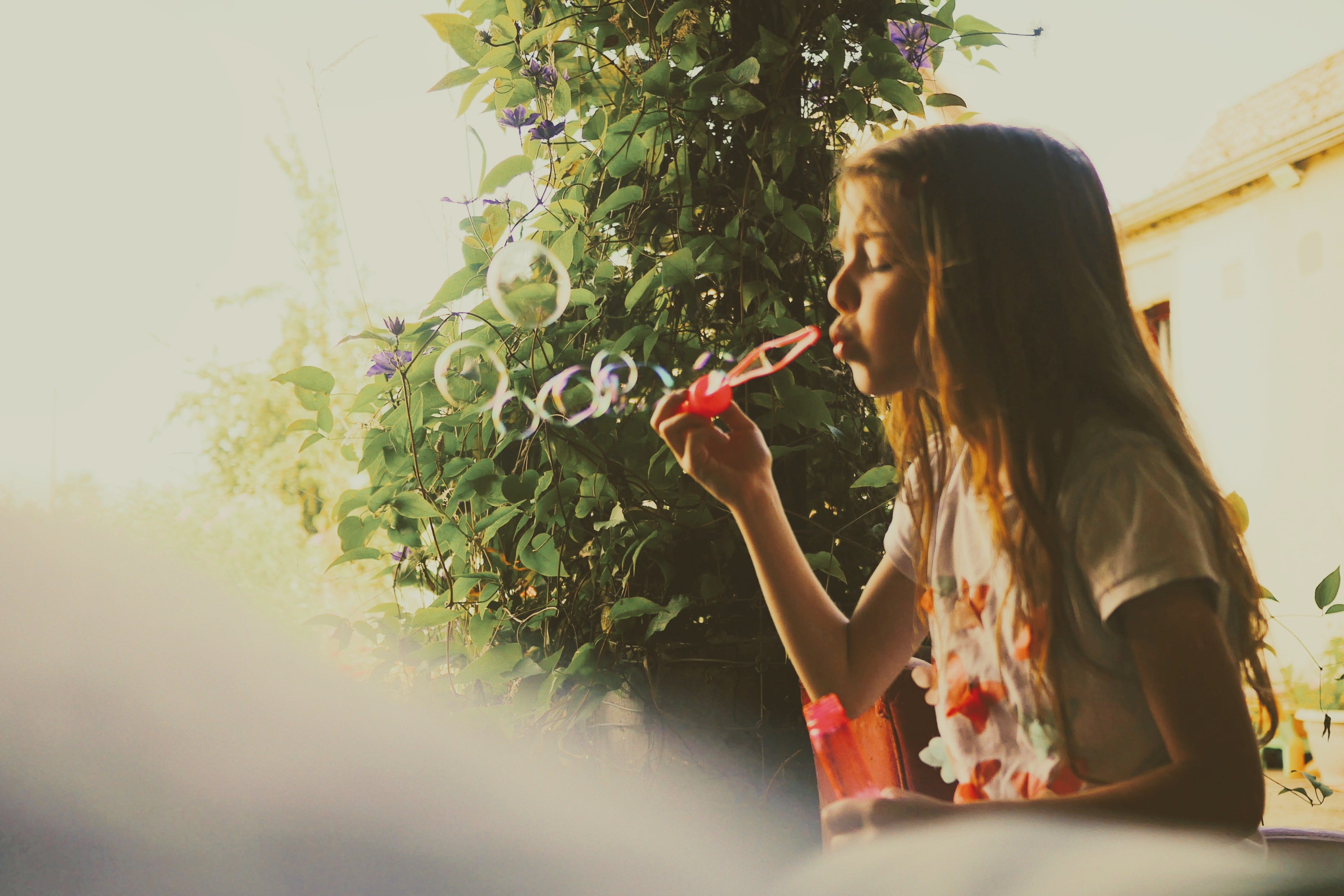
Ces derniers temps - mois, années… - les photos qui me plaisent le plus dans ma production, qui résonnent le plus avec ma sensibilité, ressemblent un peu à ça…
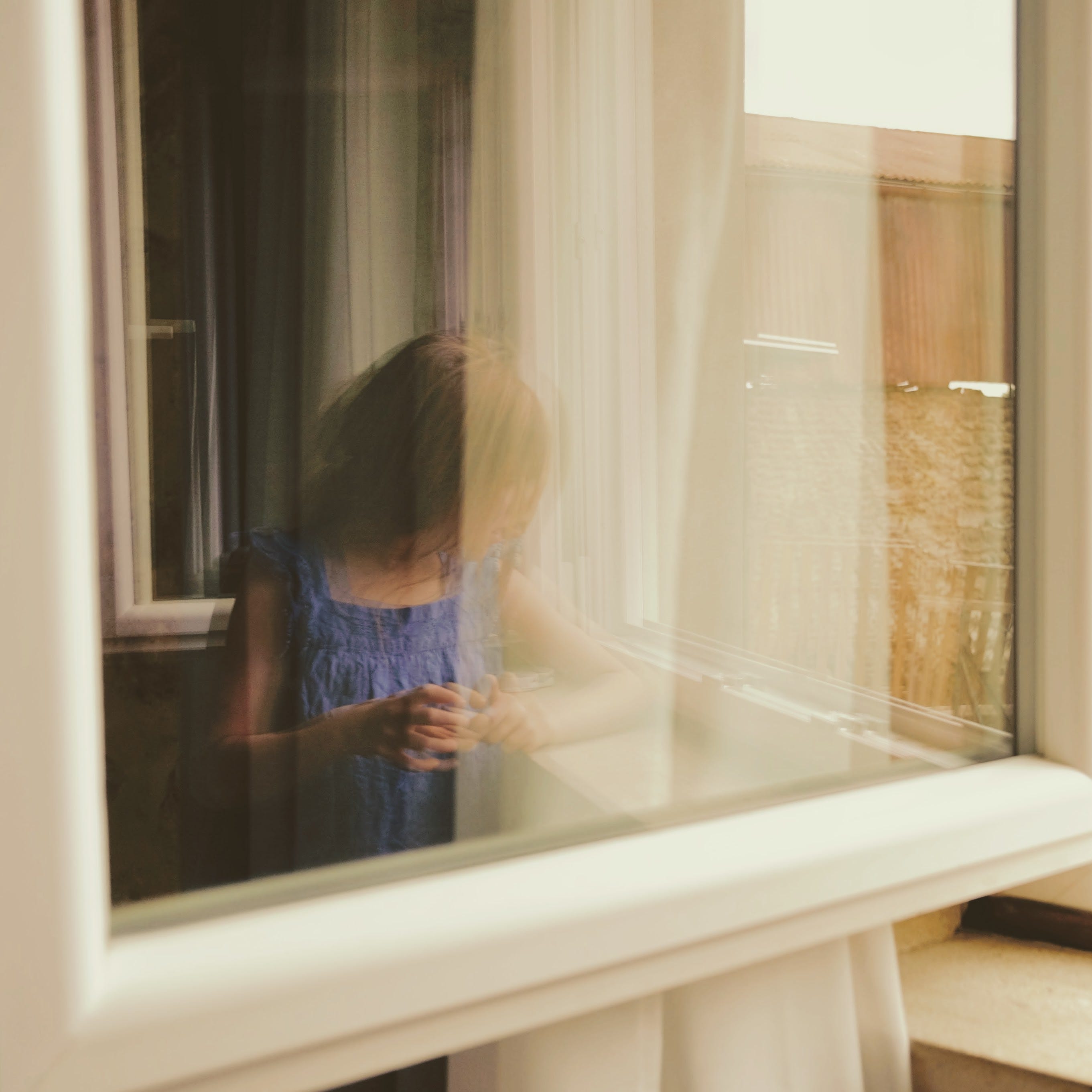
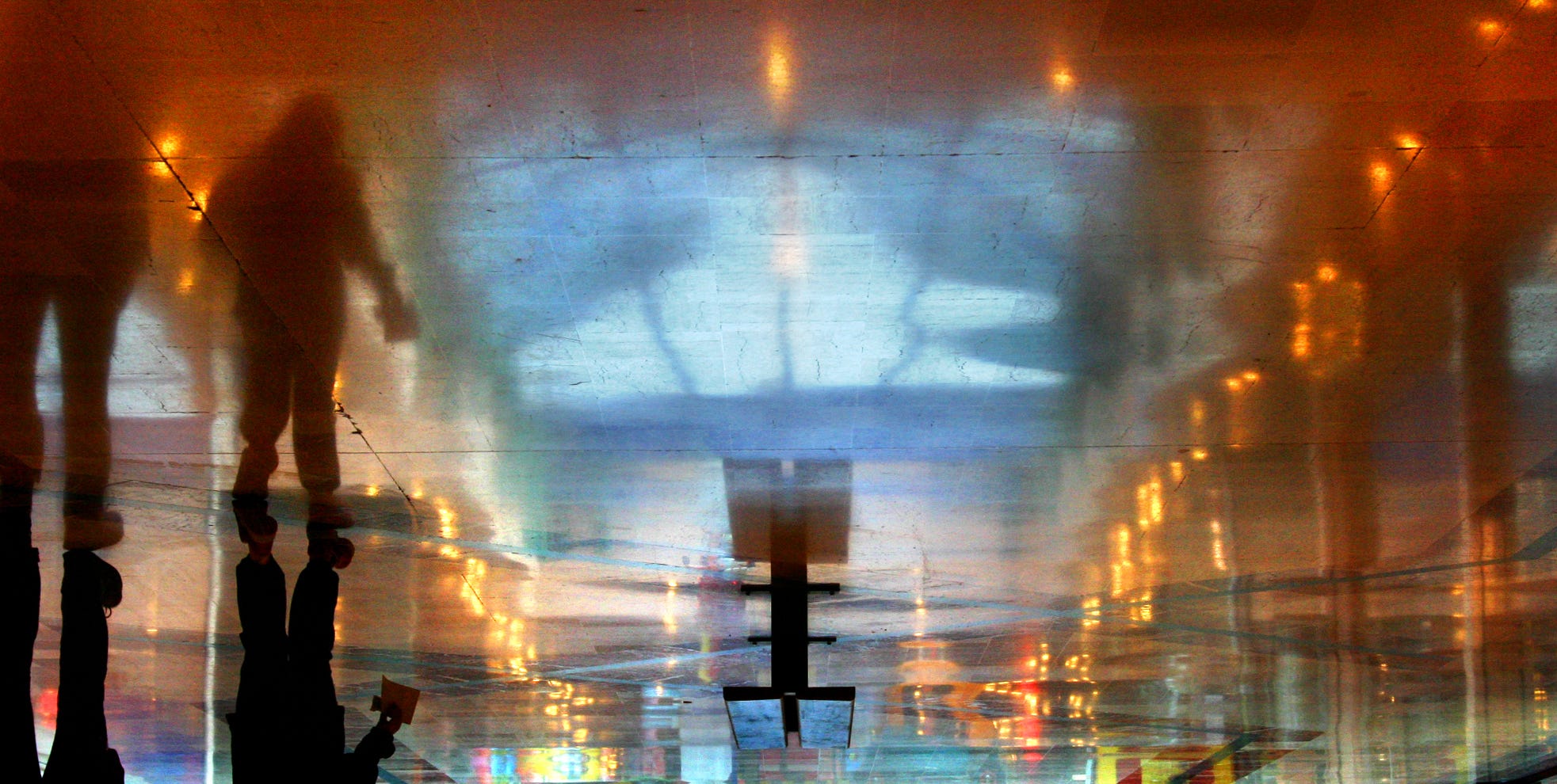
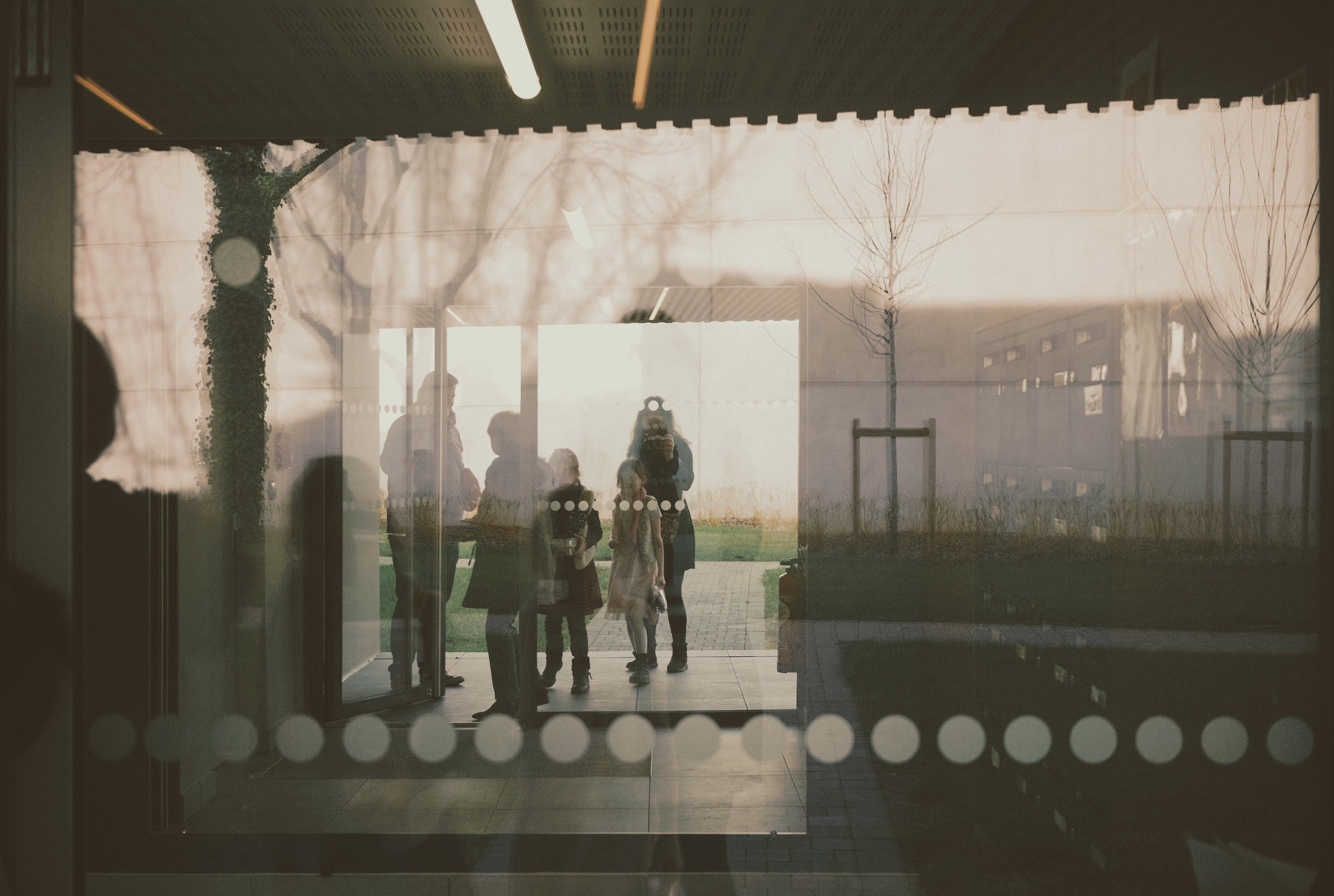
Des silhouettes mouvantes au contour indécis, des vues intrigantes (est-ce un reflet ? une vue à travers la vitre ? un autre tour de passe-passe ?!)…

Des visions plutôt mélancoliques, je dirais, mais qui ne sont pas du tout pour moi une manière d’exprimer une quelconque tristesse. Je dirais plutôt de véhiculer une ambiance, un sentiment, une émotion.
Un qualificatif m’est venu à l’esprit… Des photos “intimistes”. : )
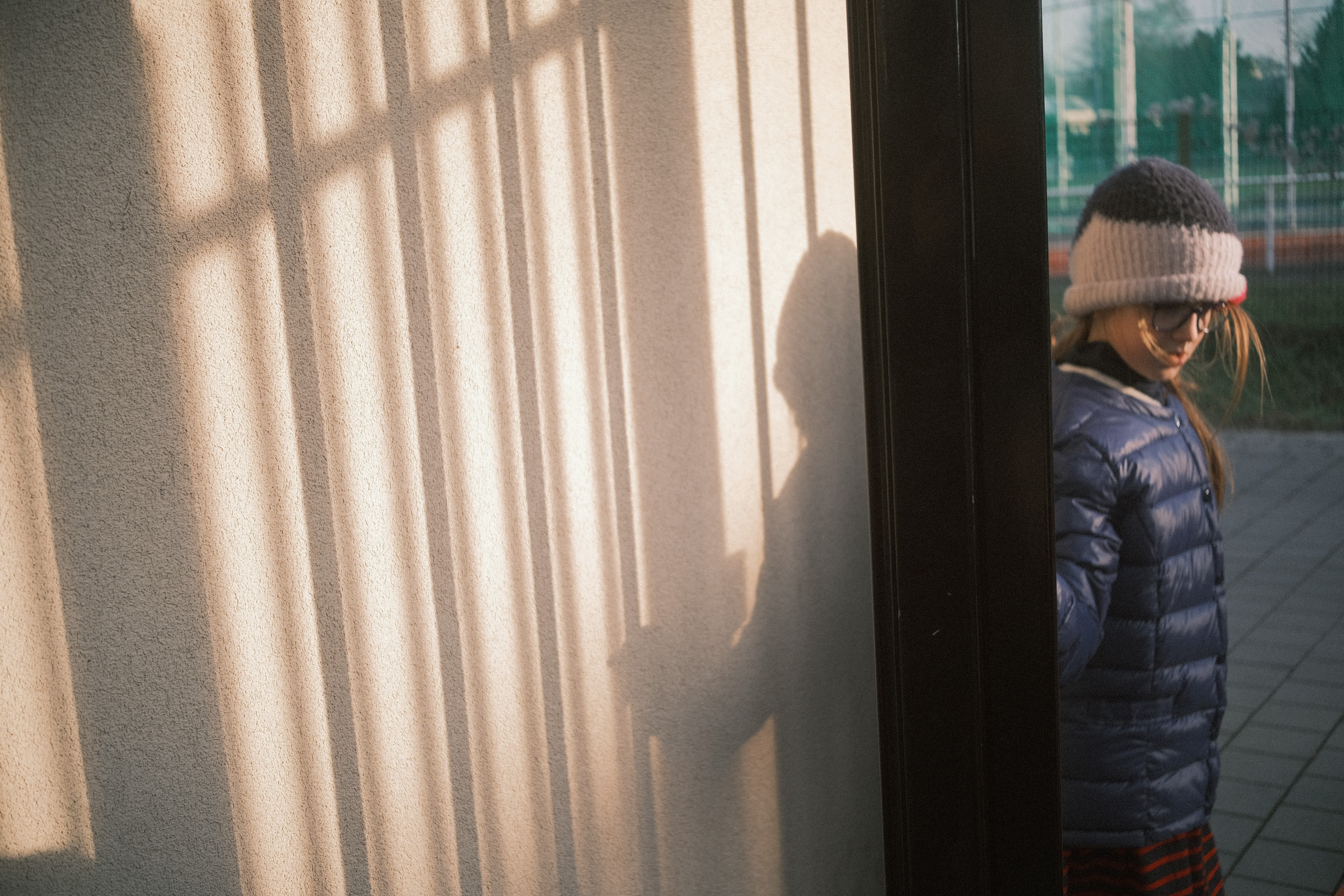
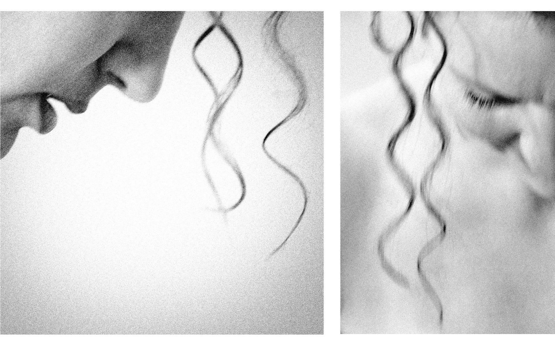
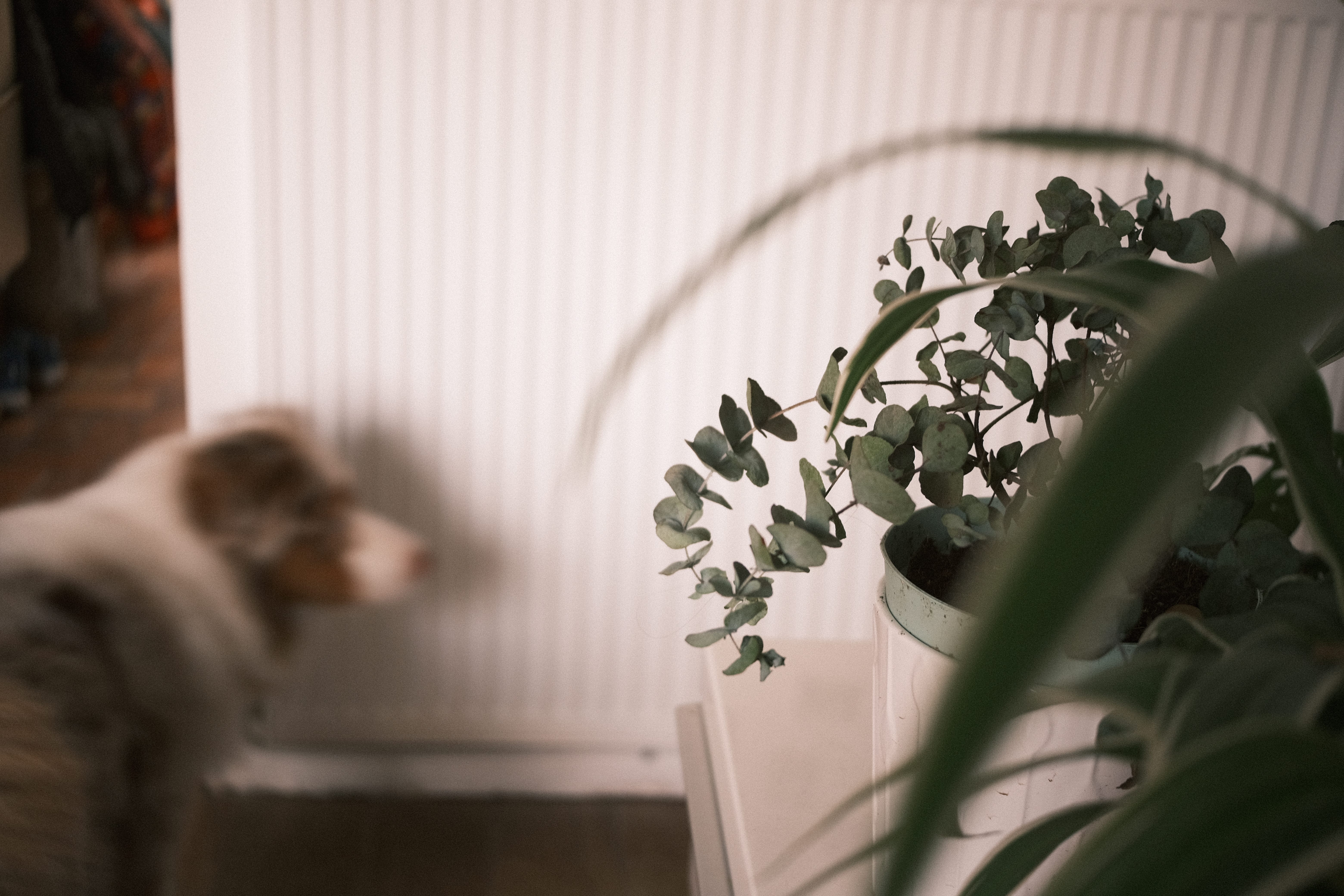
Certaines images proposent des éléments nets dans un environnement généralement indistinct, un peu comme … embué ?! Pour d’autres, on n’est même pas vraiment sûr qu’il y ait une netteté parfaite quelque part… Et, après tout, qu’importe !


C’est comme si, au fil du temps, la netteté avait été reléguée en bout de file de mes critères photographiques, qu’elle était plus ou moins devenue le dernier de mes soucis! Voire même qu’elle pouvait parfois être “contre-productive” et qu’une netteté “chirurgicale” était plutôt à éviter qu’à rechercher (j’y reviens ci-dessous).
Ceci est bien entendu à prendre avec des pincettes selon le style d’images que l’on produit et leur vocation, bien sûr. : )
Le flou ?! Cette manière de lisser ou brouiller visuellement l’image ? D’où vient-il au fait ?! En photographie, le flou peut découler :
d’une faible profondeur de champ produite par une grande ouverture de diaphragme et des jeux de distance entre les plans ;
d’un choix de mise au point qui estompe un sujet que l’on aurait plutôt attendu net ;
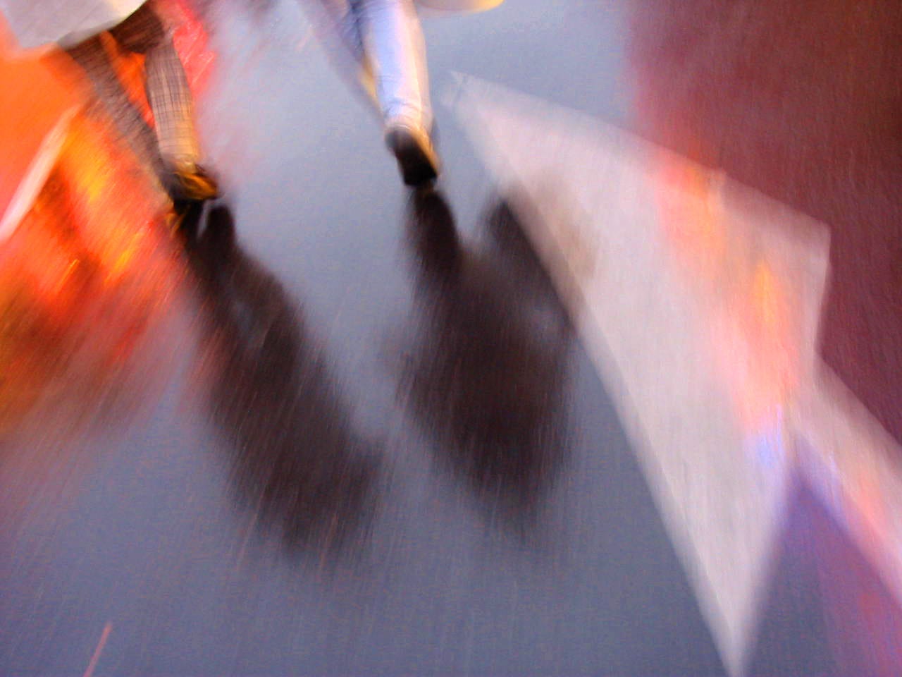
d’un temps de pose suffisamment lent et d’un mouvement - du plus imperceptible au plus franc - du sujet ou du photographe ;
d’une prise de vue à travers une “surface altérante” qui brouille l’image et rend un sujet plus indistinct (vitre embuée ou agrémentée de reflets, effet de double vitrage, voilage, élément placé devant l’objectif etc.)
d’une prise de vue indirecte qui affecte le rendu du sujet tel qu’un reflet (dans l’eau, dans une vitre ou autre surface luisante) ou encore une ombre projetée.
Les deux premiers flous, “de profondeur”, génèrent un rendu lissé, estompé.
Au contraire, les effets suivants produisent des brouillages de l’image plus complexes : directionnels (linéaire, radial…), non uniformes sur le sujet, altérant son contraste et/ou ses couleurs etc.
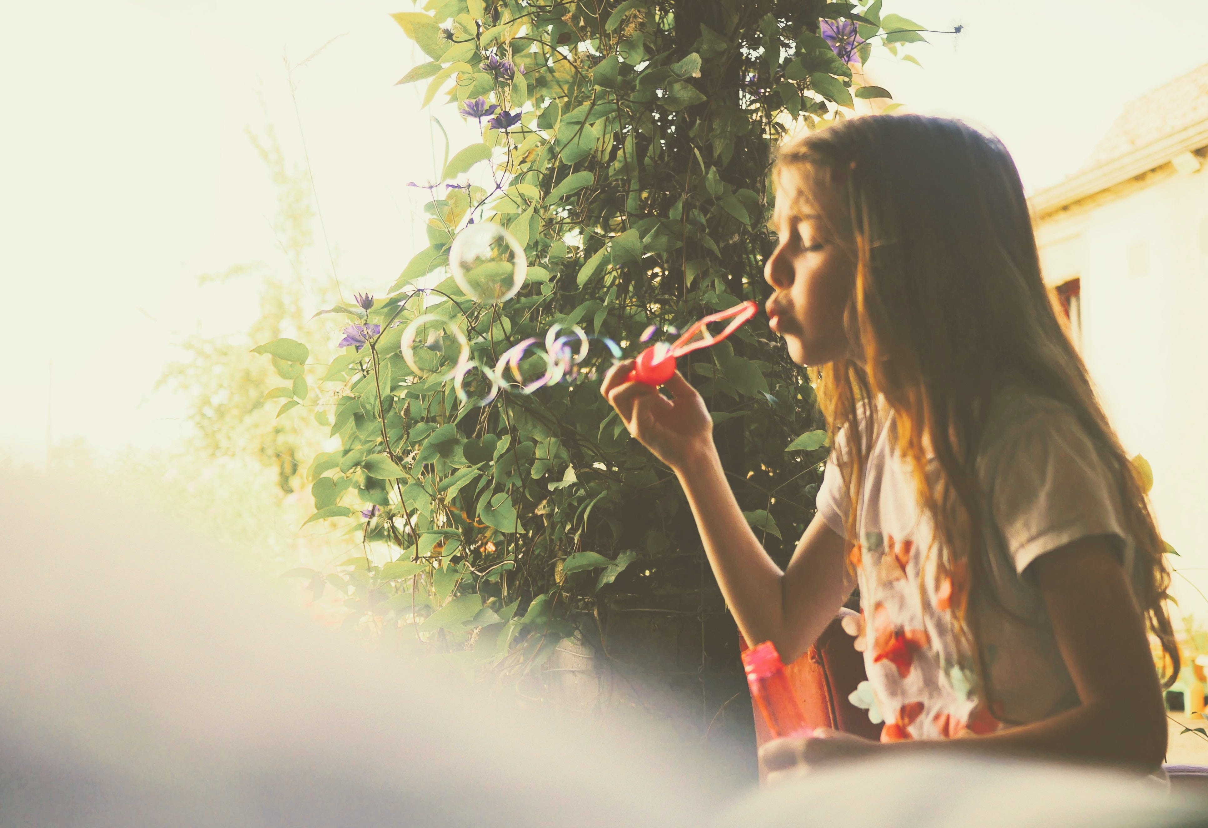
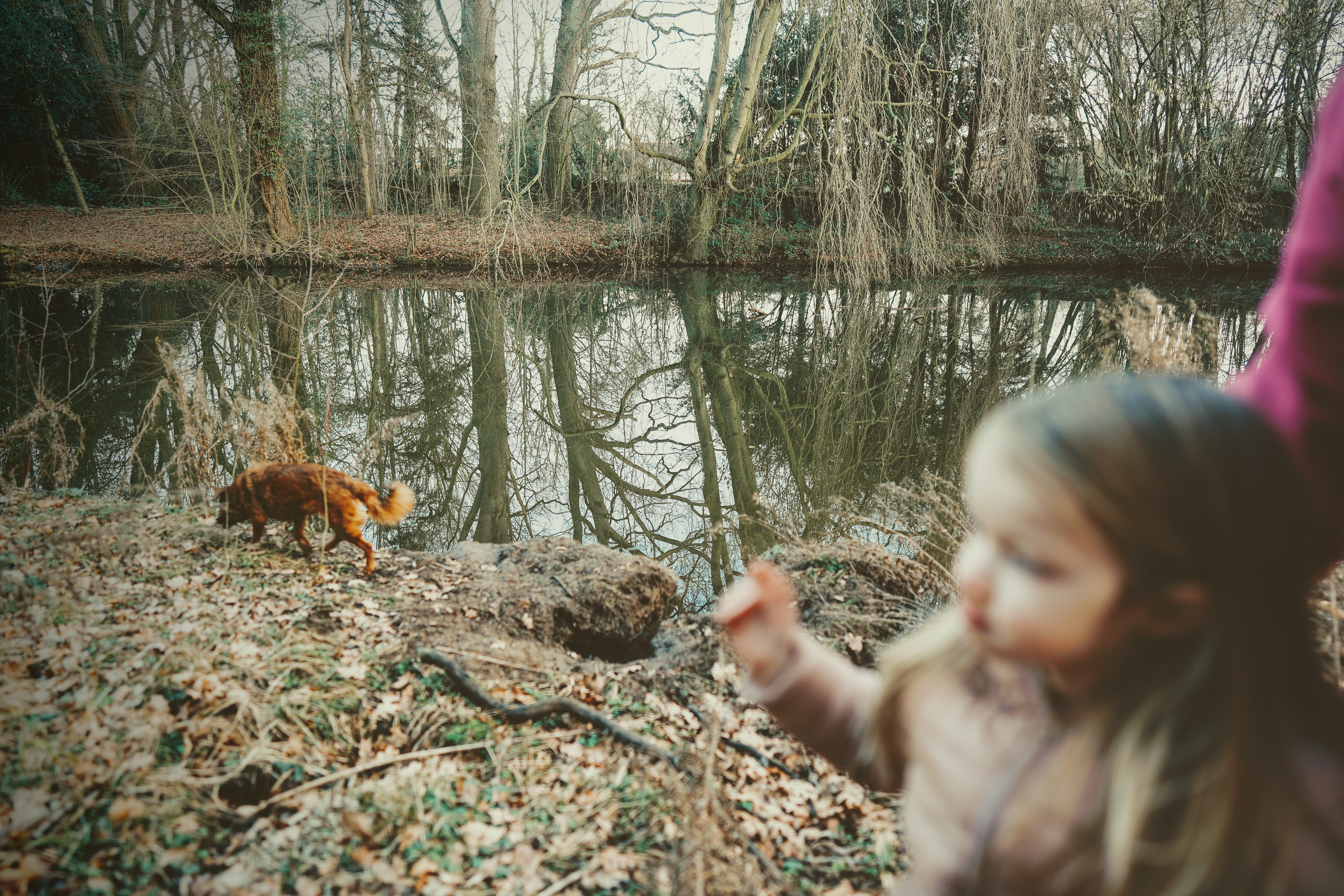
Ces variantes nous offrent tout un panel expressif ! En effet, selon le rendu appliqué et le sujet, le flou peut exprimer tantôt une fulgurance, une distance, une rêverie, la mouvance, l’inconstance… Le vacillement d’un souvenir qui se fane, l’exubérance d’un enfant, la force du vent, le caractère fugace d’un instant...
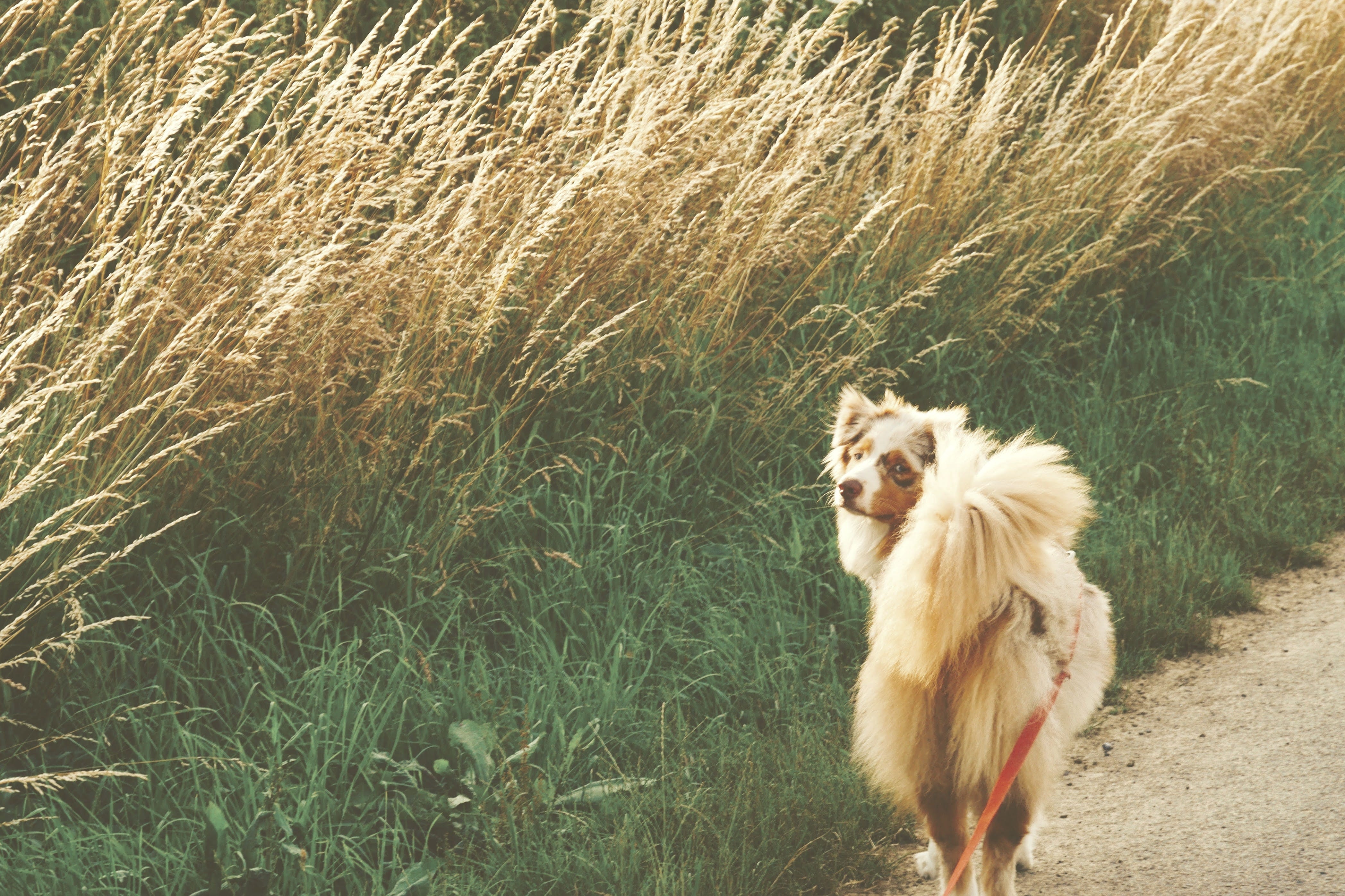
Sans doute un certain flou - quel qu’il soit - permet il d’aller au delà de l’aspect purement visuel et de chercher à montrer autre chose que des objets et personnages bien décrits ? Après tout, est-ce vraiment la texture du poil de mon chien ou le grain de peau de ma nièce que je cherche avant tout à montrer dans ces images ?! Cela semble peu probable ! Ainsi, le détail, le réalisme visuel ne constituent pas toujours un atout et peuvent même parfois desservir une image… Altérer ce réalisme, atténuer les détails grâce au flou peut alors être l’occasion d’une expression globale plus forte !
Le problème du flou, c’est qu’il est habituellement considéré comme un défaut, qu’il est censé révéler un manque de maîtrise, être le signe honteux d’un échec photographique ! Ainsi, j’imagine que nombre des images présentées dans cet article se verraient descendre sur un forum de critique photo ou dans n’importe quel concours “bien sous tout rapport” !
Il n’est pas si facile de véhiculer que le flou est intentionnel… La présentation d’une série où la cohérence visuelle globale permet au spectateur (ou au juge) de mieux rentrer dans l’ambiance et de comprendre la démarche peut sans doute aider à exprimer le caractère assumé du flou.
Il peut sembler étonnant que le flou soit si peu accepté en photographie car il est loin d’être absent du travail des grands photographes, et cela depuis des décennies ! Et je ne parle pas d’un léger flou de mouvement ou filé bien propret ou d’une profondeur de champ bien dosée mais d’une approche assurément “picturale” qui invite le flou comme une marque de style, une touche personnelle, un outil expressif en tant que tel. En connaissez / appréciez-vous quelques-uns ?
Dans un prochain post, j’évoquerai différents photographes qui assument, autorisent ou favorisent le flou dans leur travail photographique. Affaire à suivre ! : )
NB :N’hésitez pas à vous inscrire gratuitement à Substack de façon à pouvoir commenter mes articles et je parler de vos photographes avides de flou préférés !
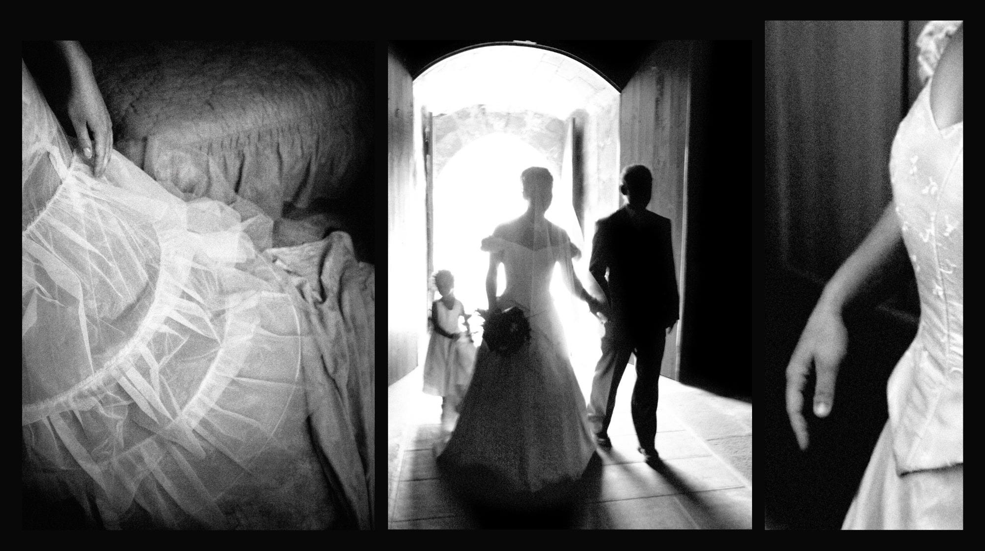
On termine avec quelques photos de mes archives (elles datent toutes d’avant 2010… ça ne nous rajeunit pas tout ça !!^^), qui montrent que je n’en suis pas à mon galop d’essai côté flou. : )
Très bonne journée et à très vite pour des partages photo + croquis de mon séjour à Paris pour le Salon de la Photo !
Anne-Laure
ENGLISH VERSION
In recent times - months, years... - the photos that I like the most in my production and which resonate the most with my sensitivity, look a little like this...

Moving silhouettes with soft outlines (like a wet in wet watercolor?!) and intriguing views (is it a reflection? a view through the window? another magic trick?!)…
These melancholy visions, I would say, are not at all for me a way of expressing any sadness. I would rather say they are meant to convey a strong atmosphere, a feeling, an emotion. I tend to call these kind of pictures : "Intimate photographs”. : )
Some images offer clear elements in a generally indistinct environment which looks a bit stemed up, misty, foggy?! For others, we are not even really sure that there is perfect sharpness somewhere... And, after all, does it matter that much?!
Please scroll up in the French article to get to see more photos of mine. The ones at the end are from my archives, prior 2010. The other ones are more recents, from the past few years and months.
It's as if, over time, sharpness had been relegated to the bottom of my photographic criteria, that it had become the least of my concerns! It even seems to me that it could sometimes be "counterproductive" and that "surgical" sharpness was rather to be avoided than sought (I'll come back to this below)! (This is of course to be taken with a pinch of salt depending on the style of images that one produces and their vocation, of course. : ) )

Blur?! This way of visually smoothing or clouding the image? Where does it come from, actually?! In photography, blur can result from:
a shallow depth of field produced by a wide aperture and some distance between the foreground, subject and background;
a choice of focus that smoothes a subject that one would have expected to be sharp;
a sufficiently slow shutter speed and a movement - from the most imperceptible to the most obvious - of the subject or the photographer;
a shot through an “altering surface” that fades or disorts the vision and makes a subject more indistinct (stemed up or reflective window, double-glazing effect, net curtain, element placed in front of the lens, etc.)
an indirect shot that affects the rendering of the subject such as a reflection (in the water or in a window or other shiny surface) or a projected shadow.
The first two blurs, “depth”, generate a smoothed, faded rendering. On the contrary, the next effects produce more complex blurring of the image: directional blurr (linear, radial, etc.), non-uniform on the subject effect, alteration of its contrast and/or colors, etc.
These variants offer us a whole range of expression! Indeed, depending on the rendering applied and the subject, blur can sometimes express an ephemeral vision, an impression of depth, a daydream, something shifting or inconstant... The flickering of a fading memory, the exuberance of a child, the strength of the wind, the fleeting nature of a moment...
No doubt that a certain blur or vision “scrambler” - whatever it may be - allows us to go beyond the purely detailed visual aspect and to seek something other than well-described objects and characters? After all, is it really the texture of my dog's hair or my niece's skin texture that I am primarily trying to show in these images?! That seems unlikely! Thus, detail, visual realism are not always an asset and can sometimes even be detrimental to an image... Altering this realism, attenuating the details thanks to blur can then be the opportunity for a stronger overall expression. We’ll see in a coming article that painters also use blur to that effect!
The problem with blur in photography is that it is usually considered a flaw. It is supposed to reveal a lack of mastery and to be the shameful sign of a photographic failure! Thus, I imagine that many of the images presented in this article would be taken down on a photo critique forum or in any “good in all respects” competition!
Thus, it is not so easy to convey that blur is intentional… The presentation of a series where the overall visual coherence allows the viewer (or judge) to better enter the atmosphere and understand the approach can undoubtedly help to express the meant nature of the blur.
It may seem surprising that blur is so little accepted in photography because it is far from being absent from the work of great photographers, and this for decades! And I am not talking about a slight motion blur, a neat pan or a well-measured depth of field but about a strong “pictorial” approach that invites blur as a mark of style, a personal touch, an expressive tool in its own right. In a future post, I will talk about different photographers who accept, allow or promote blur in their photographic work. Then, we will talk about blurr in painting! To be continued! : )
NB: Feel free to sign up for free on Substack so that you can comment on my articles and I share your own insights!
Coming very soon, sketches and creative photography from my trip in Paris for the Salon de la Photo!
Anne-Laure
Love your photographic sense. Photos don’t have to be sharp, clear shots of a subject. They represent more of what the artist is feeling. Much like a painting or any other artistic composition. Anne-Laure, I admire your sense of style and talent!!